How Colour Affects Sales: Colour Psychology in Branding — From Fast Food to Luxury
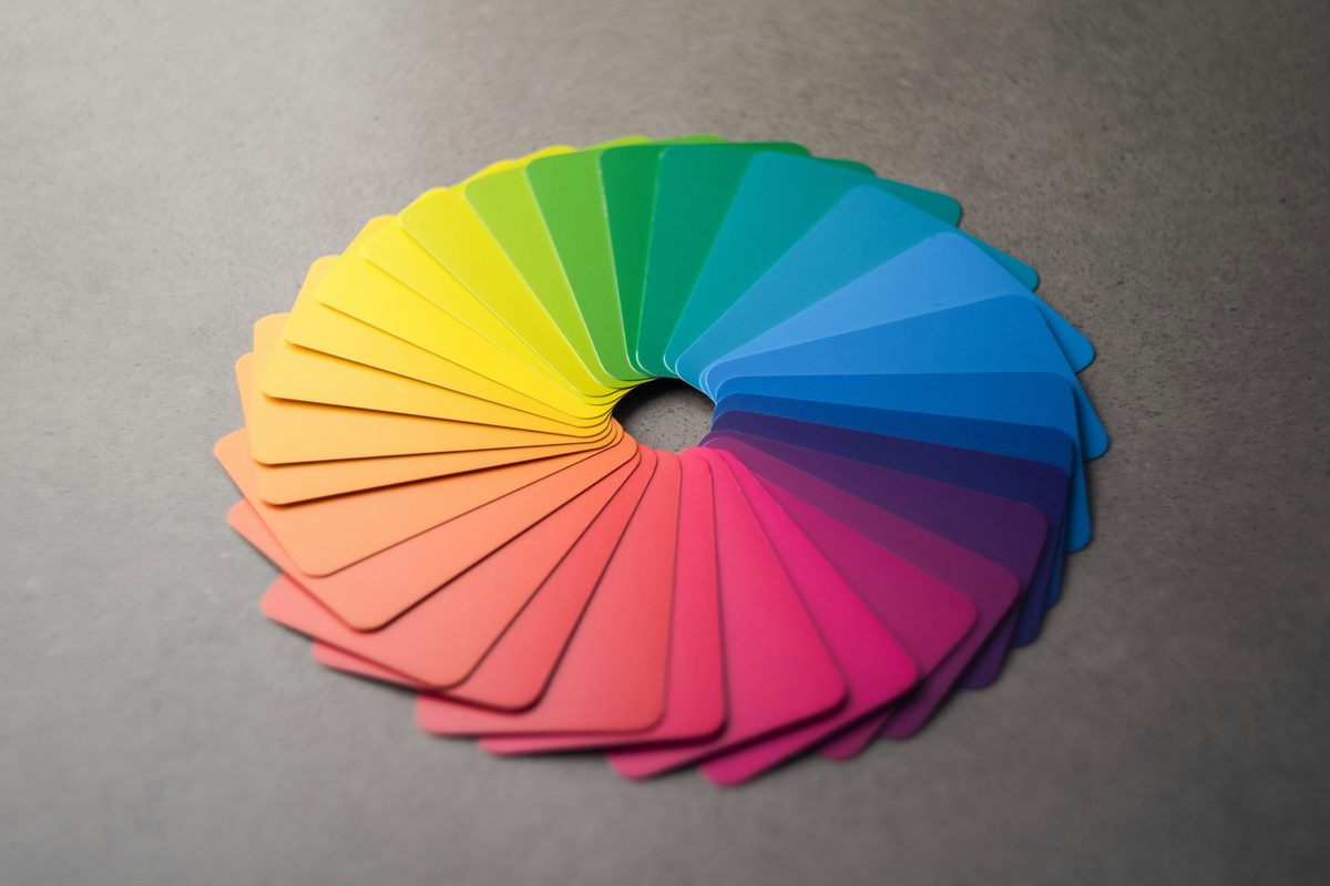
Colour isn't aesthetics — it's a message. Research shows that 62–90% of a product's initial assessment is based on colour alone, before a client reads a single word. This article is a practical guide to how colours work across different sectors, what academic research says about them — and how to make a conscious choice of colour that works for your brand.
Before a client reads your company name, they see the colour. Before they assess the quality of your service, they react to your logo's colour. Before they decide whether to trust you — colour has already led them towards that decision or steered them away from it. This isn't a metaphor. It's neurobiology.
Over 15 years in branding I've seen dozens of businesses choose colours based on the owner's personal taste, industry trends, or what "looked nice". And dozens of businesses that lost clients not because they offered a worse product — but because their visual communication was sending contradictory signals. A wrong colour isn't neutral. A wrong colour actively causes harm.
Why is colour a strategic decision, not an aesthetic one?
Dr Satyendra Singh — Professor of Marketing and Management at the University of Winnipeg, specialising in consumer psychology — published in 2006 in the prestigious academic journal Management Decision a review of research into colour's impact on buying behaviour. Singh compiled findings from several dozen independent studies in which participants assessed products, packaging and retail spaces — recording both stated preferences and measurable physiological responses (heart rate, attention duration, reaction time). The conclusion was unequivocal: 62–90% of a product's initial assessment is based on colour alone, and the initial emotional decision is made within approximately 90 seconds of first contact with a brand — before a client has had the chance to read the name, price or product description.
Loyola University Maryland calculated that consistent use of colour increases brand recognition by up to 80%. The Color Institute (CCICOLOR) states that 92.6% of consumers put visual factors first when making a purchase, and 84.7% consider colour the most decisive of all visual elements. Meanwhile, 85% of shoppers say colour is the primary factor when choosing between similar products.
Translating this into business terms: two products of equal quality, at the same price — the one with better-matched colour will sell more often. This sounds intuitive, but it has robust experimental backing. In Singh's studies, participants shown identical products in different packaging colours consistently attributed higher quality and higher value to the ones in "correct" colours — and differences in stated willingness to purchase reached several tens of percentage points. Colour didn't change the product. It changed how the product was perceived. And perception — in buying decisions — is reality.
How does colour build brand identity across different sectors?
There is no single colour psychology — there are many, depending on context. The same shade of blue works differently in a law firm, differently in a toy shop, and differently in a restaurant. Below is a survey of six main sectors — with concrete examples and the mechanisms behind them.
Finance and insurance — why does blue mean trust?
Look at the logos of banks and financial institutions. Barclays, HSBC, NatWest, Lloyds, Chase, American Express, Santander — nearly all operate on blue or navy. This isn't an accident or a fashion. It's the answer to one question: what must a client feel when entrusting their money to someone?
Research by Ha (2009) and Kosova (2025, "Coloring Trust") experimentally confirm what every banker intuitively understood: cool, low-saturation shades of blue — particularly navy and steel — maximise perceived trust in a financial context. Blue is associated with stability, competence and security. It is one of those colours that functions similarly across different cultures — which is of considerable importance to global financial institutions.
For a local financial adviser, accountancy firm or solicitor — navy or dark blue is a solid, research-backed foundation for a palette. Not because "everyone does it" — but because clients have spent decades learning to read this colour as a signal of credibility.
This mechanism operates well beyond finance. Politicians and their campaign teams have for years applied colour psychology with similar precision. Navy suits are practically the uniform of Western leaders at summit appearances — blue communicates seriousness, stability and competence. A red tie is a signal of strength and dominance — not by accident. Colour in politics is just as calculated a strategic decision as in corporate branding.
Food and fast food — why is McDonald's yellow and red?
Red stimulates appetite and raises the heart rate. Yellow captures attention and is associated with energy and optimism. Together they form a combination sometimes called the Ketchup and Mustard Theory in marketing circles — which for good reason appears in the logos of McDonald's, Burger King, KFC, Pizza Hut and Subway.
This is not accidental. Labrecque and Milne (2012) in research on mapping colours to brand personality confirmed that red and yellow are the strongest stimulators of appetite and purchase impulsiveness — which in fast food categories, where the decision to enter a restaurant often takes just a few seconds, translates directly into turnover.
It is worth noting, however, what McDonald's did across Europe: in many countries, including Germany, the chain replaced red backgrounds with green ones. The reason was strategic — the change was intended to shift perception towards "eco and healthy", responding to growing European consumer sensitivity about the environment and food quality. The same brand, the same product — a different colour, different associations, a different customer.
For a restaurant, café or bakery: warm colours (orange, terracotta, burgundy, warm yellow) build an atmosphere of hospitality and stimulate appetite. Cool blues and clinical whites suit the healthy food, salad and diet category — there the "cool cleanliness" effect is an asset, not a weakness.
A practical tip: If you run a café or bistro with an active Instagram presence — check what colours dominate your posts and stories. Do they create a coherent, recognisable atmosphere? If someone scrolled through your last nine photos, could they describe your brand in one sentence? If not — you have a colour problem, before you even think about a logo.
Luxury — why do black and gold say "expensive"?
Chanel, Prada, Rolex, Louis Vuitton — black, white, gold, deep burgundy. Reviews of luxury brand visual identity show a consistent dominance of dark, desaturated palettes with precise gold or silver accents. Castlespace in their analysis of luxury and emotion (2024) describes how muted, high-quality colours build a psychological sense of exclusivity — because a colour that "shouts" is associated with mass availability, while a colour that "whispers" suggests exclusivity.
The mechanism is simple: luxury is inaccessibility. A colour that is commonplace, that you see everywhere, cannot communicate exclusivity. This is why luxury brands often register specific shades as intellectual property. Tiffany & Co. has used their shade of blue since 1837 and formally registered it as a trademark (Pantone 1837 Blue) in 1998. Research on "colour priming" shows that this shade has itself become a carrier of emotion — a box in that colour communicates luxury before anyone checks what is inside.
Cadbury fought a similar battle over Pantone 2685C purple. The case reached the courts (EWHC 1671 (Ch), 2022) — and the ruling confirmed that years of consistent colour exposure can justify its protection as a trademark. Colour can be a legal asset.
Health and wellness — why do green and white feel calming?
Clinics, pharmacies, GP practices, supplement brands, health food shops — green and white. The pattern is so consistent that inverting it would be an alarm signal to clients. And that's precisely the point.
Green codes for nature, freshness, safety and health. White is associated with sterility, cleanliness and medical professionalism. Research on so-called processing fluency — the ease with which visual stimuli are processed — shows that when the colour of packaging or a premises matches the expectations of the category, the consumer experiences an instinctive sense that "this is the right place". Conversely: a colour that doesn't fit the category generates unconscious dissonance.
A dental practice in warm brick-brown tones might be very stylish — but some clients will feel an unexplained unease there, because the brain isn't receiving the signal "sterile and safe". Colour psychology is not a dictator, but ignoring it has a price.
A practical tip: Do you run a clinic, massage studio, health food shop or yoga studio? Check whether your profile photos, social media graphics and website operate a consistent palette of greens, whites or pastel neutrals. A single bright colour — even used incidentally — can shatter the effect of calm and cleanliness you build with everything else in your communication.
Technology — why do 60% of the biggest tech brands use blue?
Meta, IBM, Microsoft, Intel, Samsung, Dell, HP — blue dominates in technology. Analyses of tech industry branding estimate that around 60% of large technology brands use blue as their main or important secondary colour. The mechanism is similar to finance: blue communicates intelligence, stability and data security — which in a category where clients entrust companies with their data is the critical message.
White as a background amplifies the effect of interface cleanliness and simplicity — which fits the UX philosophy that good software is transparent, doesn't get in the way, is "clean". Apple spent years building its aesthetic on exactly this: minimalism, white, silver — technology that doesn't intimidate, but invites.
Exceptions to blue in tech — like Snapchat's yellow or YouTube's red — are deliberate differentiators. Snapchat wanted to be entertaining, youthful and light — yellow achieved this. YouTube wanted energy and entertainment — red hit the emotional core of a video platform.
Fashion and retail — when is colour a statement?
In fashion, colour is a language. Chanel and Louis Vuitton speak in black and gold: timelessness and exclusivity. Hermès speaks in orange: courage, energy, unconventionality. Tiffany speaks in pale blue: romance and elegance. Colour here isn't an ornament — it's an identity.
In food retail the rules are different. Whole Foods, Waitrose's organic ranges, Planet Organic — greens and earthy tones. The signal: natural, local, chemical-free. IKEA — yellow and blue, a maximally inclusive and friendly combination that says: "this is for everyone, don't be afraid to come in". Aldi and Lidl — red, yellow and blue in various configurations, always at high saturation: it's loud here, there are bargains here, you should hurry.
For a small fashion boutique or craft shop: your palette should answer the question of what story you want to tell. Natural beiges and ecrus say "handmade and authentic". Black and navy say "premium and timeless". Vivid accents say "bold and unexpected".
What do A/B tests say — does changing colour really increase conversion?
This is one of the most frequently asked questions I hear from clients. And I have an answer that is more complex than popular headlines suggest.
A/B tests do show conversion increases after changing the colour of a CTA button — reported values are 18–34% increases in clicks. But meta-analyses of thousands of tests show something more important: the effect comes mainly from contrast and visual hierarchy, not from a "magic" shade. A red button on a green background converts better than a green one — because it is more visible. The same red on a red headline background might convert worse than anything else.
Heinz in Turkey did something very intelligent: instead of changing the colour, they defined it. The company placed their signature shade of red on the label as a reference point for consumers — so they could tell original ketchup from imitations. The campaign results: 97% brand recognition accuracy, 73% decrease in topping-up Heinz bottles with other ketchups, and 24% increase in restaurant usage. This wasn't an A/B test — it was a strategic decision based on a deep understanding of colour's role in building trust.
On the other hand: Heinz EZ Squirt — green ketchup from 2000 — sold more than 10 million bottles in 7 months and generated around $23 million in sales. It sounds like a success. And it was — a temporary one. In 2006 the product was discontinued. Analyses point to novelty fatigue and a decline in parental trust in an "unnaturally" coloured product. A colour that breaks expectations can attract — but it must offer more than surprise to retain a customer.
Where colour psychology can fail — cultural differences and pitfalls
The mechanisms described above apply in Western culture — and to a large extent globally. But there are places where the map stops working.
White in the West means purity, minimalism, elegance. In many East Asian countries — China, Japan, Korea — it is the colour of mourning and funeral dress. A luxury goods brand entering Asian markets with white packaging and a clean aesthetic may land in an unintended emotional context.
Red in China means good fortune and prosperity — which is precisely why it dominates the packaging of premium products aimed at Chinese consumers. In South Africa the same red has strong associations with mourning and violence. In the West — energy, danger, love.
Green, which in Europe we associate with nature and ecology, has negative cultural connotations in Indonesia and parts of Southeast Asia. In China, "green hat" is an idiom for a cuckolded man — which makes green headwear there a practically unsellable product.
For most businesses operating in a single domestic market this is theoretical knowledge, not a practical concern. But it's worth knowing — particularly if you're thinking about expansion, international clients, or communication on social media with a global reach.
How to choose a colour for your brand — a practical guide
After 15 years working with brands of all sizes — from sole traders to companies employing hundreds of people — I have a few principles I apply consistently.
First question: what should a client feel when they see your brand?
Not: "what do I like". Not: "what's fashionable". What should your client feel? Trust? Excitement? Calm? A sense of exclusivity? Energy? Each of these emotions has its colour equivalents — and that's where you should start.
Second question: what does your category say — and do you want to confirm it or challenge it?
If everyone in your industry uses blue — you can stand out with a different colour. But you need to do this consciously and have a reason that is understandable to the client. Accidentally differentiating yourself with colour is not a strategy — it's a risk.
It's worth looking at the table below — a condensed colour overview across six sectors:
| Colour | Key associations | Sectors where it dominates | Brand examples |
|---|---|---|---|
| Blue | Trust, stability, competence, security | Finance, tech, insurance | Barclays, Samsung, IBM, LinkedIn |
| Red | Energy, appetite, urgency, passion | Fast food, retail, entertainment | McDonald's, Coca-Cola, YouTube |
| Yellow | Optimism, accessibility, attention | Fast food, mass retail | McDonald's, IKEA, Snapchat |
| Green | Nature, health, freshness, growth | Wellness, health food, eco | Whole Foods, Waitrose Organic, Spotify |
| Black | Luxury, exclusivity, timelessness | Premium fashion, luxury, design tech | Chanel, Apple, Rolex |
| Purple | Creativity, mystery, premium | Confectionery, cosmetics, media | Cadbury, Hallmark, Milka |
| Orange | Energy, friendliness, innovation | Technology, retail, communications | Amazon, Hermès, EasyJet |
Third question: are you prepared to be consistent for years?
Tiffany & Co. has used one shade of blue for over 180 years. Cadbury fought years of legal battles to keep its purple. The value of a brand colour is built over time — and it is directly proportional to the consistency of exposure. Changing a brand colour is a serious decision and a serious cost: new materials, new signage, new websites, reprogramming perception in clients' minds. It's worth doing it once, and doing it well.
Fourth question: how will the colour behave at every touchpoint?
Logo. Website. Social media. Packaging. Business card. Story graphics. The colour must work in every one of these contexts — on a white background, on a dark background, on a phone screen in bright sunlight and on a large monitor. A good brand colour is testable — before you order packaging, before you launch an Instagram campaign, check how your colour behaves in each of these places.
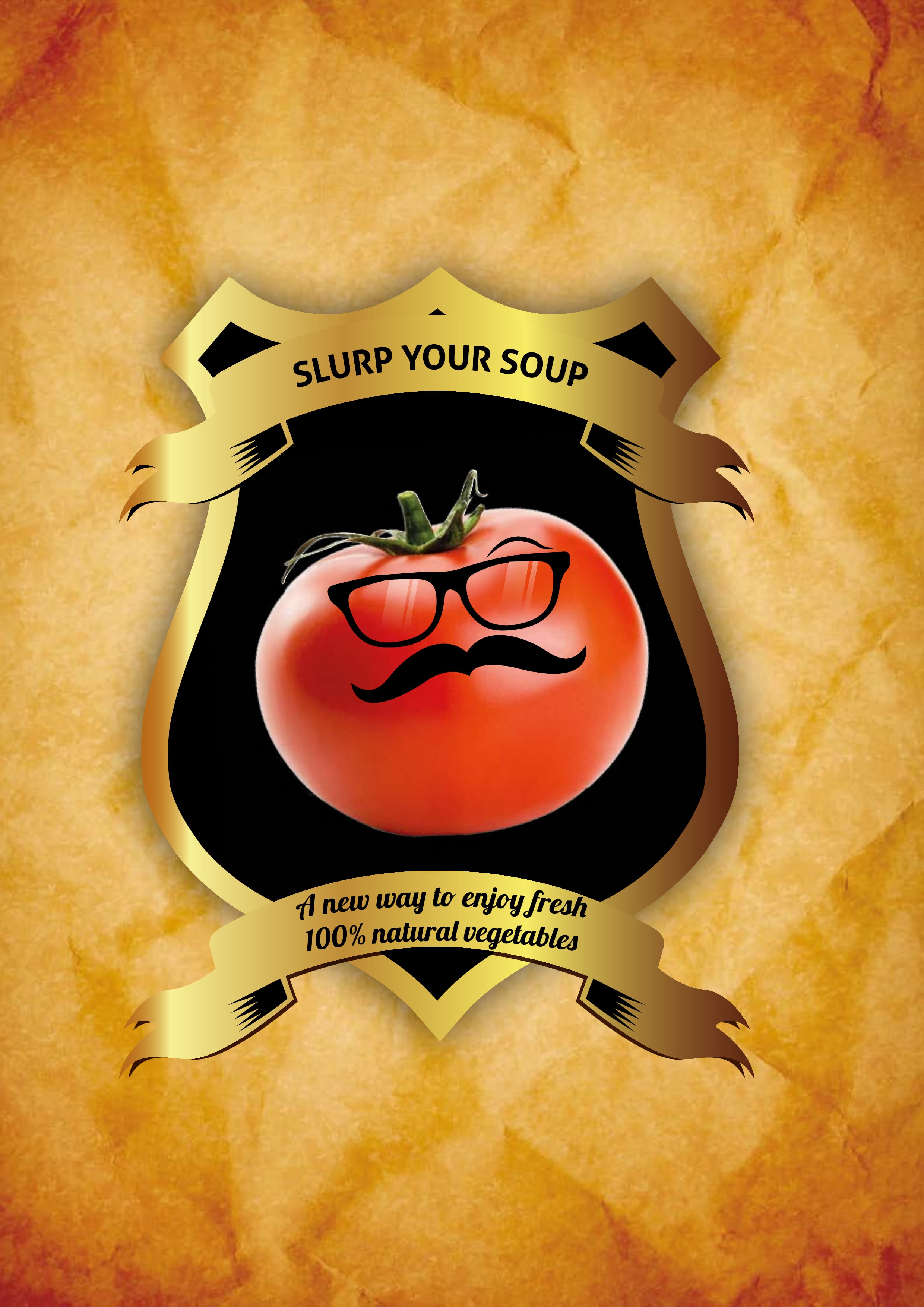
Case study: Slurp Your Soup — a colour deconstruction of a 2012 project
I want to show how colour psychology works in practice — using a project I designed myself. Slurp Your Soup was a London artisan soup brand I created in 2012. When writing this article in May 2026, I asked a colleague — someone who knows branding but had no knowledge of the brief or the history of the project — to look at the graphic alone, without context, and tell me what he saw. Below is the comparison: his reading versus my design intentions.
Palette: black, gold, intense tomato red, warm beige-brown background.
What the outside eye read: Black and gold communicate premium — which you don't expect from a soup, and that's precisely the strength of this palette. A tomato with glasses and a moustache is a character with personality, warm and human, not taking itself too seriously. Tomato red — intense and natural — is the only loud colour in the whole composition, attracting the eye without vulgarity. The background in the colour of aged paper gives an authenticity effect: something artisanal, homemade, non-mass-produced. The shield framing the tomato in a golden border suggests tradition and stability — as if this soup had a history behind it, even though it was a new brand. The message: this is not a cheap product, but someone with a sense of humour made it.
What was designed — and where the outside eye slightly missed the mark: The background isn't "aged paper for authenticity" — it is a deliberate depiction of raw, unbleached ecological cardboard. In 2012, showing undyed packaging material was a bold statement: we don't need to colour this for you, because the quality speaks for itself and we respect the planet. Vegetables from local farmers, minimal distance from field to kitchen, zero artificial additives — the background carried all of this meaning in a single visual signal. My colleague read "authenticity" — he caught the emotion, but not the full mechanism. Which is entirely understandable: we were doing this deconstruction in 2026, looking at a graphic alone without the physical packaging in hand. Had he been the target customer — a Shoreditch resident, that East London creative middle-class neighbourhood where some of Europe's most interesting food brands were emerging in 2012 — and picked this soup up from a shop shelf, I'm certain he would have hit the mark precisely.
The heraldic shield was a deliberate device: placing the mascot within a heraldic form gives it the gravitas and stability of an institution, not a joke. Combined with red — because food, because tomato, because appetite — and gold — because this product was meant to cost something and be worth its price — the brand sent a precise message to the Shoreditch urban consumer: eco, artisanal soup from local suppliers for busy people who know what they want and aren't afraid to pay for it.
The conclusion I draw from this years later: good use of colour works even when the viewer doesn't decode all the layers of intention. My colleague landed on "premium", "character", "authenticity" and "humour" — because those messages were encoded in the colour clearly enough. That he didn't precisely land on "eco raw material" — that's not a failure of the design. It's the natural limit of how much a single colour can say without words and without physical context. The packaging in hand, the text on the box and the shelf in the shop said the rest. Colour isn't the whole language — it's the grammar on which that language is built.
Two tools worth having to hand
When I work on a colour palette for a client, I regularly use two tools I recommend to everyone — regardless of budget or project scale.
Coolors.co is a colour palette generator — you enter one colour and the tool proposes harmonious combinations. You can browse ready-made palettes by other users, filter by mood, sector or shade. The free version is entirely sufficient for design work. If you have a logo and are wondering how to complement it with background, accent and typography colours — this is your first step.
Fontpair.co is a tool for pairing typefaces — and although this is typography rather than colour, both decisions are inseparable. A premium colour with a market-stall font is a dissonance that destroys the whole effect. Fontpair shows ready-made pairs with application examples — for headline and body copy — and filters by style: serif, sans-serif, display, mono.
FAQ
How does colour influence customer buying decisions?
Research shows that 62–90% of a product's initial assessment is based on colour alone (Satyendra Singh, Management Decision, 2006). 85% of shoppers say colour is the main factor when choosing between similar products. Colour works before a client consciously reads anything — it communicates the industry, the price level, brand values and triggers emotions.
What colours work best for a small business brand?
There is no single "best" colour — what matters is fit with your sector and target audience. Service businesses building trust (law, finance, consulting) should consider blue or navy. Wellness and health businesses — green or white. Restaurants and food — warm colours: red, orange, yellow. The key rule: colour must be consistent across all client touchpoints — logo, website, social media, packaging.
Does changing the colour of a logo or CTA button really affect sales?
Yes, but with an important caveat. A/B tests show 18–34% conversion increases after changing a CTA button colour — but the effect comes mainly from contrast and visual hierarchy, not from a "magic" shade. Heinz in Turkey defined their signature red shade and recorded a 24% increase in restaurant usage and 97% brand recognition accuracy. Colour consistency increases brand recognition by up to 80% (Loyola University Maryland).
Does colour psychology work the same way across different cultures?
No. Colour associations differ significantly between cultures. White in the West means purity and elegance — in many East Asian countries it is the colour of mourning. Red in China symbolises good fortune and prosperity; in the West — danger or love. Green, which in Europe we associate with nature, has negative cultural connotations in parts of Southeast Asia. For most businesses operating in one domestic market this is theoretical knowledge, but worth knowing for expansion.
How long should a brand colour last — is it worth changing it?
Tiffany & Co. has used one shade of blue since 1837 and registered it as a trademark in 1998. Cadbury fought years of legal battles to protect its purple, winning in court (EWHC 1671 (Ch), 2022). This shows that a brand colour is a long-term investment — value is built through years of consistent exposure. It is worth changing only when a brand changes its positioning or moves into a new market segment.
Sources and data
The following data was used in this article. All sources are from 2003–2026.
- 62–90% — share of product's initial assessment based on colour alone; decision within approx. 90 seconds. Source: Satyendra Singh, "Impact of color on marketing", Management Decision, 2006
- 80% — increase in brand recognition through consistent use of colour. Source: Loyola University Maryland, cited by Colorcom and Color Institute
- 85% — share of shoppers for whom colour is the main factor when choosing between similar products. Source: CCICOLOR / Institute for Color Research
- 18–34% — CTA conversion increase after changing button colour (contrast effect, not a magic shade). Source: compiled A/B test analyses, nijournals.org, 2025
- 97% / 73% / 24% — results of Heinz "Label of Truth" campaign in Turkey: brand recognition accuracy, decrease in counterfeiting, increase in restaurant usage. Source: Heinz campaign analyses, 2022–2024
- 10 million bottles / $23 million — sales of Heinz EZ Squirt (green ketchup) in the first 7 months after its 2000 launch. Discontinued in 2006. Source: Heinz brand historical analyses
- approx. 60% — estimated share of large tech brands using blue as primary or significant secondary colour. Source: sector branding analyses, Shinecreative, Beyondaum
- Pantone 1837 Blue — Tiffany & Co.'s registered shade, trademarked in 1998. Source: Tiffany & Co. brand history, Pantone data
- EWHC 1671 (Ch), 2022 — ruling confirming Cadbury's right to protect Pantone 2685C purple as a trademark. Source: British High Court of Justice
- Joe Hallock, "Colour Assignments", 2003 — study of 232 people from 22 countries; 42% name blue as their favourite colour, 57% of men choose blue. Source: Hallock's own research, cited in marketing literature
Chris Rocket
Brand strategy and web design for businesses in the UK and Poland. 15 years of experience building brands and websites grounded in perception psychology and data.
Want to know what your brand colour is saying?
I'll review your logo, palette and visual identity for consistency and sector fit. The brief takes 10 minutes, the consultation is free.