How a Rebrand Changed the Positioning of a London Recruitment Agency
Pegaz Recruitment came to me as a monochromatic "boutique" brand speaking almost exclusively to employers. The "cold luxury" aesthetic was repelling candidates, ignoring one half of the market, and the website was a brochure. The logo stayed. Everything else changed — and the agency became a Global Recruiter UK Awards finalist.
The Challenge
Pegaz entered the London recruitment market with premium aspirations. A monochromatic palette, cool typography, heavy "boutique" aesthetics. Everything said: we are for a select group of employers. Communication was almost 100% one-directional — the website, content and tone were all addressed to companies looking for people.
The site was a one-page brochure. No action pathways, no narrative, no foundations of trust. Job listings showed only roles — no organisational culture, no team faces, no "why you'd want to work here". Testimonials were generic and unconvincing. Cold luxury looked elegant, but it wasn't selling.
Strategy
After a full brand and UX audit, I retained one element — the icon and logotype. Pegaz had strong brand equity in the graphic mark itself. Everything else went into redefinition.
Identity and voice
Energetic yellow plus a friendlier tone aligned with Millennial expectations. Less distance, more humanity. "Hire For The Future" instead of "premium boutique recruitment".
Two audiences, two journeys
Dedicated user pathways for employers and candidates. Two different narratives, two different CTAs, two different tones — within one coherent site. Because employers and candidates are looking for completely different things, and the site needed to speak to both.
Trust-building content
Real culture signals in job listings (team, atmosphere, values of the hiring company), credible testimonials with context, "how it works" sections reducing the candidate's psychological risk.
Candidate services
CV writing, interview coaching, LinkedIn makeover. Pegaz stopped being an intermediary — it became a career development partner.
Multilingual specialisation
Focus on bilingual talent — candidates fluent in English plus at least one other language. This niche allowed Pegaz to differentiate itself in London's saturated recruitment market.
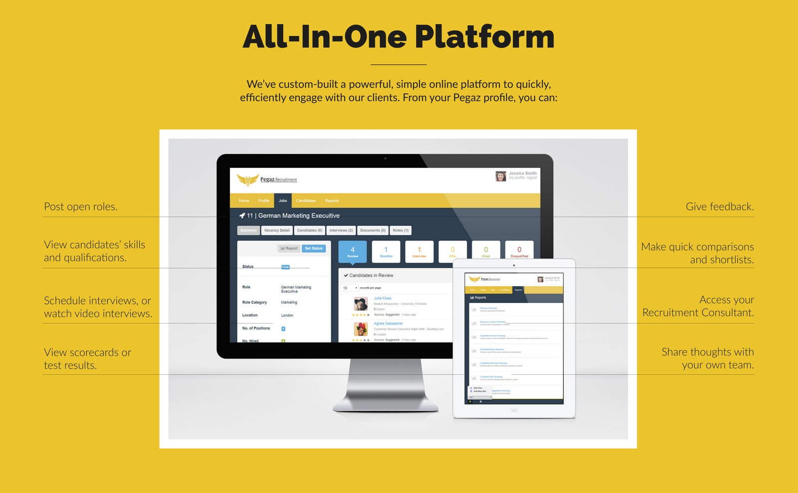
Technical implementation — the All-In-One Platform
The boldest element of the transformation: building a bespoke client portal. This was pre-AI 2017–2018 — but the logic was already the same as today: automate what can be automated, give the client transparency over the process, eliminate email chaos.
What the portal did:
- Self-service job posting
- clients posted their own listings, which automatically published to the site
- Candidate management
- shortlists with photos and full profiles, making it easy to recognise a candidate at a glance
- Team collaboration
- sharing candidate profiles within the client's team with feedback exchange
- Star rating system
- internal candidate scoring system
- Real-time dashboard
- recruitment stage, test results, live status of every candidate
- Automated analytics
- number of candidates at each stage, active roles, application metrics
- Direct chat
- integrated chat with a dedicated Pegaz consultant
- Language testing
- certified language test results displayed within candidate profiles
Language as a certificate
I implemented an online certified language testing system in partnership with a linguistics company. This solved Pegaz's niche focus on bilingual roles — it guaranteed quality before the interview, not after it.
Marketing — content, automation, social proof
A rebrand without a communication layer is decoration. I designed an integrated marketing ecosystem:
- Content marketing
- hub with industry insights and career guidance — organic traffic and thought leadership
- Email automation
- nurturing sequences for both employers and candidates, personalised job alerts and market insights
- LinkedIn strategy
- comprehensive company presence, content strategy for networking and sourcing
- Real-time chat
- native live chat on the site for direct support and lead capture
- Multilingual SEO
- content strategy designed around multilingual recruitment searches
- Social proof
- authentic testimonials and case studies from successful placements across multiple languages and sectors
Business impact
The transformation delivered value across several areas. The custom platform eliminated emails getting lost in inboxes, manual scheduling and unclear communication pathways. Clients gained unprecedented control and transparency.
- Operational efficiency
- elimination of email chaos and manual scheduling through automation
- Client autonomy
- self-service reduced administrative overhead while simultaneously increasing satisfaction
- Process transparency
- real-time dashboards built trust and reduced client uncertainty
- Quality assurance
- language testing guaranteed language requirements were met before interviews, not after
- Scalability
- automated systems supported business growth without proportional headcount increases
Strategic outcome
Pegaz evolved from a distanced "luxury" aesthetic into an accessible challenger brand for two audiences — retaining what was already working (the logo). The new identity and UX created clarity, credibility and momentum. Dual journeys supported better decisions on both sides of the market.
Pegaz was recognised as a multilingual specialist and became a finalist for the Global Recruiter UK Awards 2018 in the "Best Newcomer" category. The integrated marketing approach generated sustainable growth across multiple channels, and the custom platform created an operational advantage over traditional agencies still relying on outdated processes.
Before → After
Recognition
Pegaz Recruitment was a finalist for the Global Recruiter UK Awards 2018 in the "Best Newcomer" category. Independent validation of the strategy — from "cold luxury" boutique to a challenger brand for two audiences, combined with a pre-AI automation platform. The award recognises the best new players in the UK recruitment market.
My role
Brand Strategist & Technical Lead. I led the complete brand transformation, custom platform development, UX/UI design, content strategy and integrated marketing automation. Collaboration with leadership and development teams — to deliver a coherent ecosystem that automated recruitment workflows while simultaneously building authentic brand connections.
Pegaz is an example of how a rebrand is not just a colour change. A rebrand is re-answering the question: "for whom exactly are we — and why should someone choose us?" When the answer changes, everything changes: identity, website, tools, the way you communicate. The logo is often the only thing worth keeping.
Chris Rocket
Brand strategist and web designer with 15 years of experience in Poland, the UK and Europe. I design websites and visual identities — from strategy through design to code — as one person, no subcontractors. Every project starts with questions and data, not aesthetics.
Planning a rebrand or product transformation?
If you need brand strategy and custom platform development under one roof — I'll respond concisely and quickly. The brief takes 10 minutes.